Learn more about ProjectionLab’s origin story.
This year, I decided I needed a better understanding of my long-term financial trajectory. What’s my life actually going to look like? How would specific decisions affect it? The realization I’m undeniably approaching 30 prompted some questions I didn’t have quick answers to. During the pandemic, I wandered around listening to books and podcasts on personal finance / financial independence; and as I absorbed the principles, I wanted to see this stuff visualized in a way I could play and experiment with.
But FinTech products are a dime a dozen right? Surely there’s already one that just… does this? Well, there are some cool apps for budgeting and understanding where your money is going (Mint and YNAB come to mind), but I was surprised I couldn’t find something with modern UX and a short learning curve where you can build nuanced long-term models, and which is actually fun to play around with… not to mention doesn’t sell your data or have marketers calling you.
So now you’re thinking “okay, this is when he decided to build ProjectionLab”… well, almost. First I tried to make a spreadsheet. But it wasn’t long before things started to get out of hand:

That formula was just the tip of the iceberg, and the whole thing quickly became untenable. Still, I had a pretty clear idea of what features I wished for as a user to help navigate all these life choices, so I started to develop a web app.
Some criteria I had at the time:
-
No account linking: On top of the data / privacy considerations, as a user I’ve actually experienced a surprising amount of friction with other apps that try to aggregate and sync your real financial data, especially when you have 2FA on everything (which you should). I wanted ProjectionLab focused on modeling the long-term vision, not mired down in account linking just to capture your initial conditions.
-
Experimentation has to be fun: When the user wonders things like “what if I rented instead of buying this house”, I wanted the interface to feel like the answer is close at hand… not buried in a dozen separate menus where every change takes 10 seconds to re-render simulation results.
-
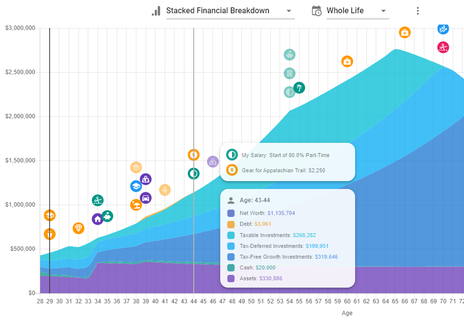
Strong visual link between model and results: When I was messing around with plots in that spreadsheet, I would sometimes wonder “why is there a spike there again?” If life events are causing key inflection points or other artifacts, I wanted a design where that felt clear and recognizable.
-
Yearly breakdowns: There are other retirement planners where you can export some data underlying the plots, but rarely can you drill into a given year and see the full list of everything that happened. For ProjectionLab, I wanted something where you could step through and look at every simulated year in detail.
There were many more ideas, requirements, and design considerations along the way, but I’ll spare you the rest for now 🙂
After several months of nights and weekends, you can see what I came up with and test out the real app yourself by heading over to the ProjectionLab home page. You can get started right away without needing to create an account.
For those who would like a quick preview, the screenshots below show a cross-section of what you can do. If you end up checking it out, I’d love to hear what you think! You can reach me at kyle@projectionlab.com, or you can join the ProjectionLab Discord Server.
ProjectionLab Includes:
-
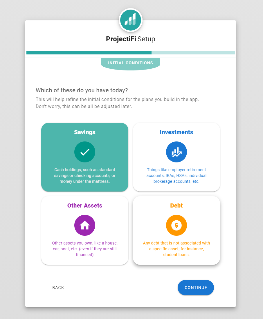
Simple setup wizards to capture your initial conditions:
-
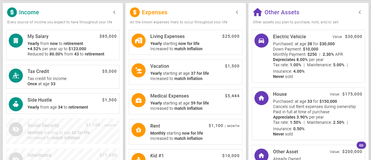
Granular modeling with the ability to toggle things on and off:
-
Simulation results integrated with life events:
-
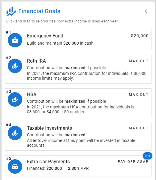
Financial goals you can click and drag to re-prioritize and see the effects:
-
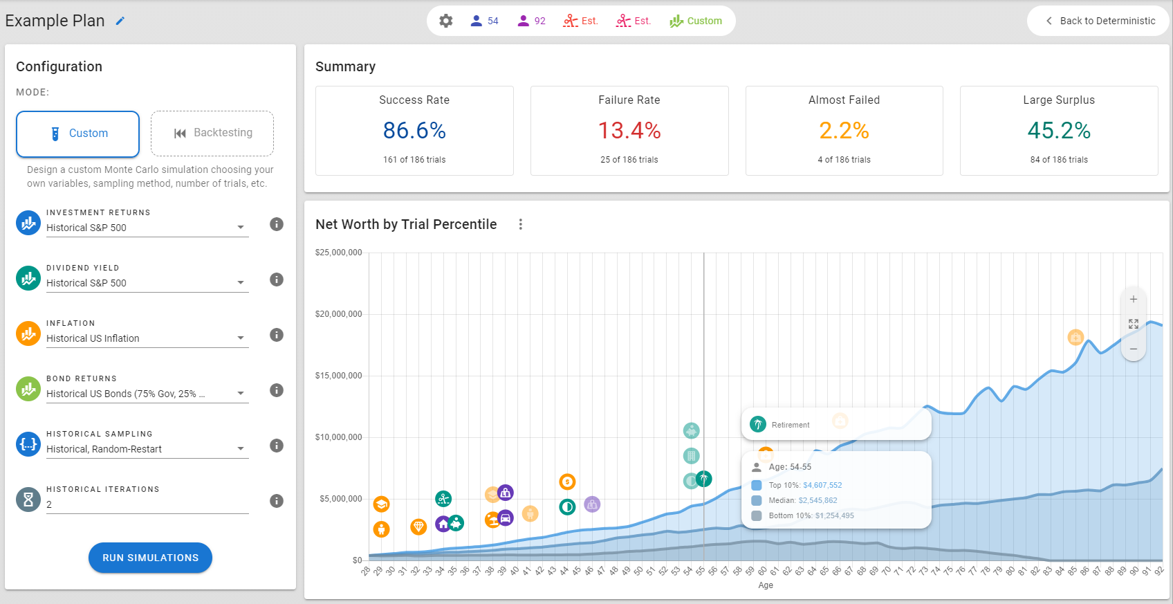
Monte Carlo simulations to visualize the spectrum of possible outcomes based on historical data:
